
I designed a shipped component as a finished layout. Supporting a second orientation meant rebuilding it in production.
One Timeline, Two Orientations
Where it started
The original request came from the Mayor's Office and Sustainable Cambridge. Both needed a way to show a project's history and major milestones.
I explored a horizontal timeline first, but Sustainable Cambridge exposed the limit quickly: its timeline had around 30 entries, and the horizontal layout became too difficult to scan.
The vertical version handled that scale, so we built and shipped it. It's live on the site today.
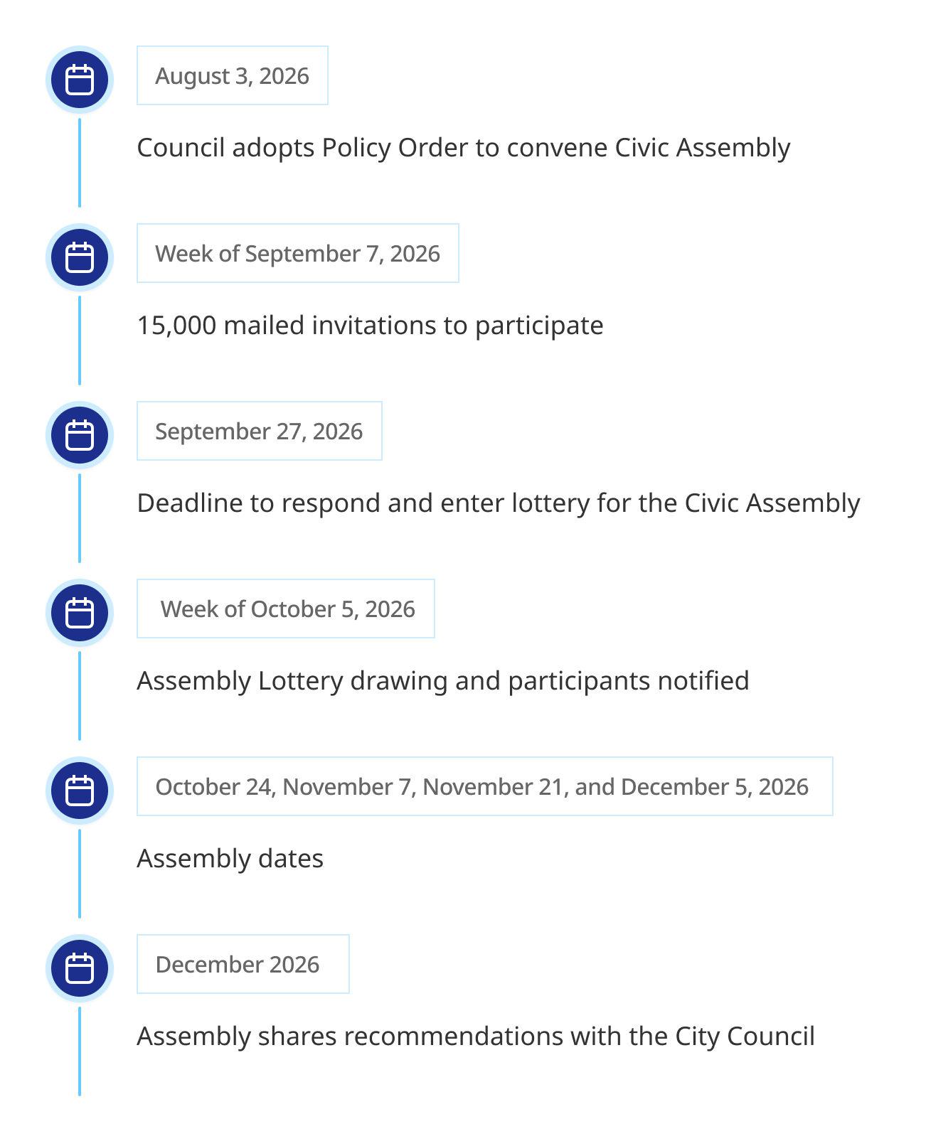
The vertical timeline, live on cambridgema.gov.
Two timelines, designed at different times
Before the Mayor's Office and Sustainable Cambridge request, I had already designed a timeline for project pages and gotten it approved. It hadn't entered the development queue yet, and it looked different from the vertical timeline we later shipped.
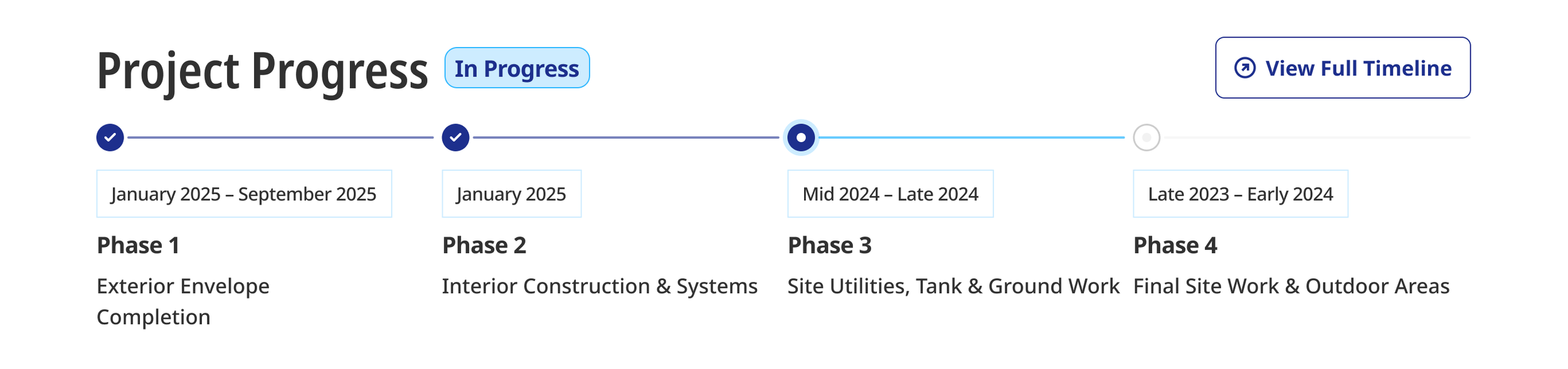
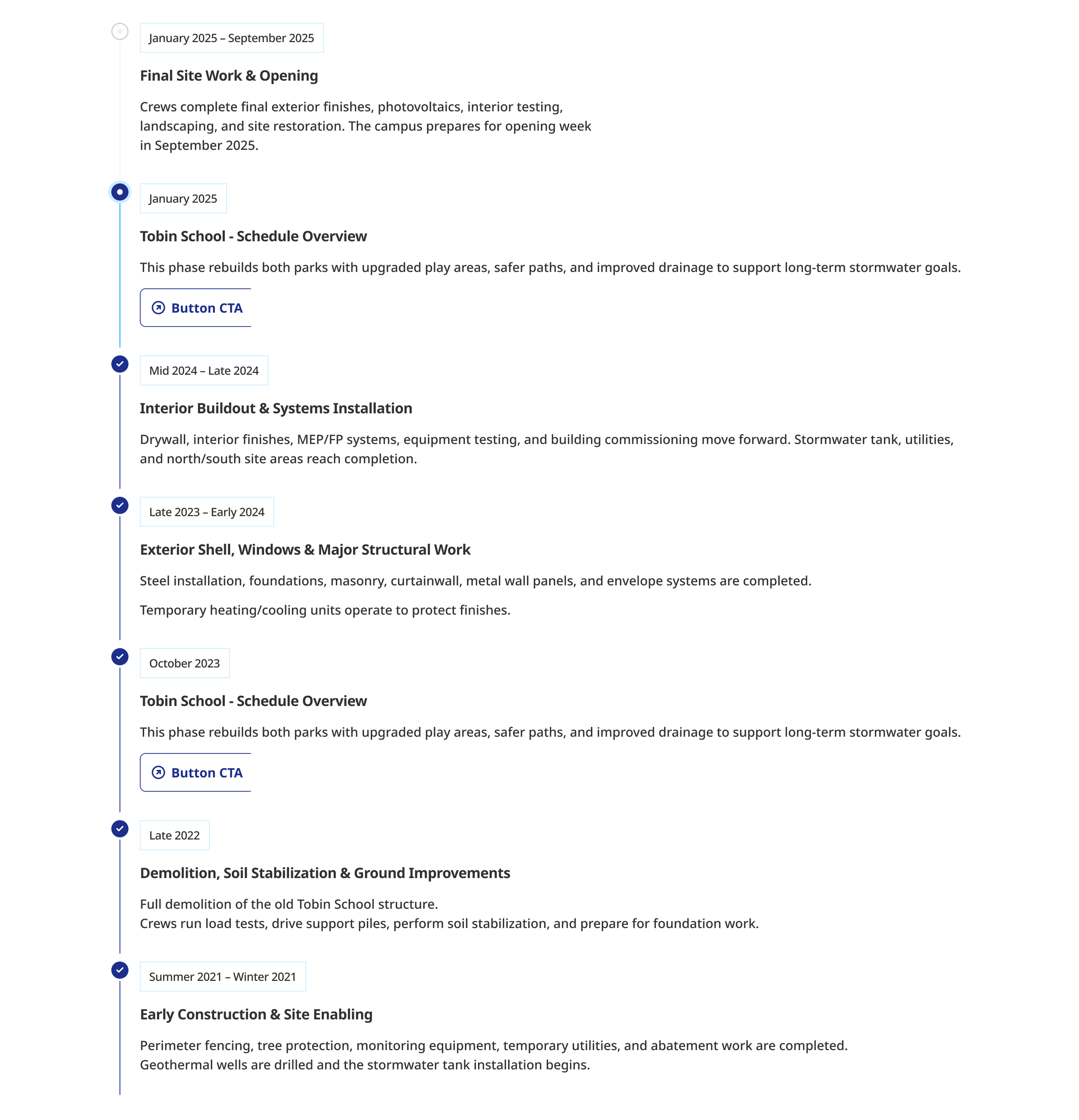
Project pages had a different job. The landing page shows only a few phases (planning, design, construction, completion), so residents see the current phase and what comes next at a glance. "View Full Timeline" opens the complete timeline.
Once the vertical timeline shipped, the City would have two timeline designs doing the same job in two different ways. So I redesigned the project page timeline to match, with the same markers, dates, and phase labels. The images on the left show the redesign: the horizontal summary on the project landing page, and the full timeline that "View Full Timeline" opens.
The vertical timeline didn't have the parts to support a second layout, so I added them. Those new parts reached back into the original vertical timeline too.
Below, you can see 7 (Desktop) variants of the Timeline component, built from the same parts. Placeholder content is shown. Content producers add their own in the CMS.
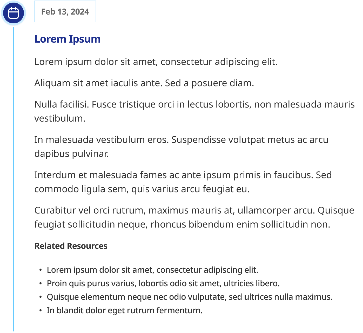
Timeline Component with Icon
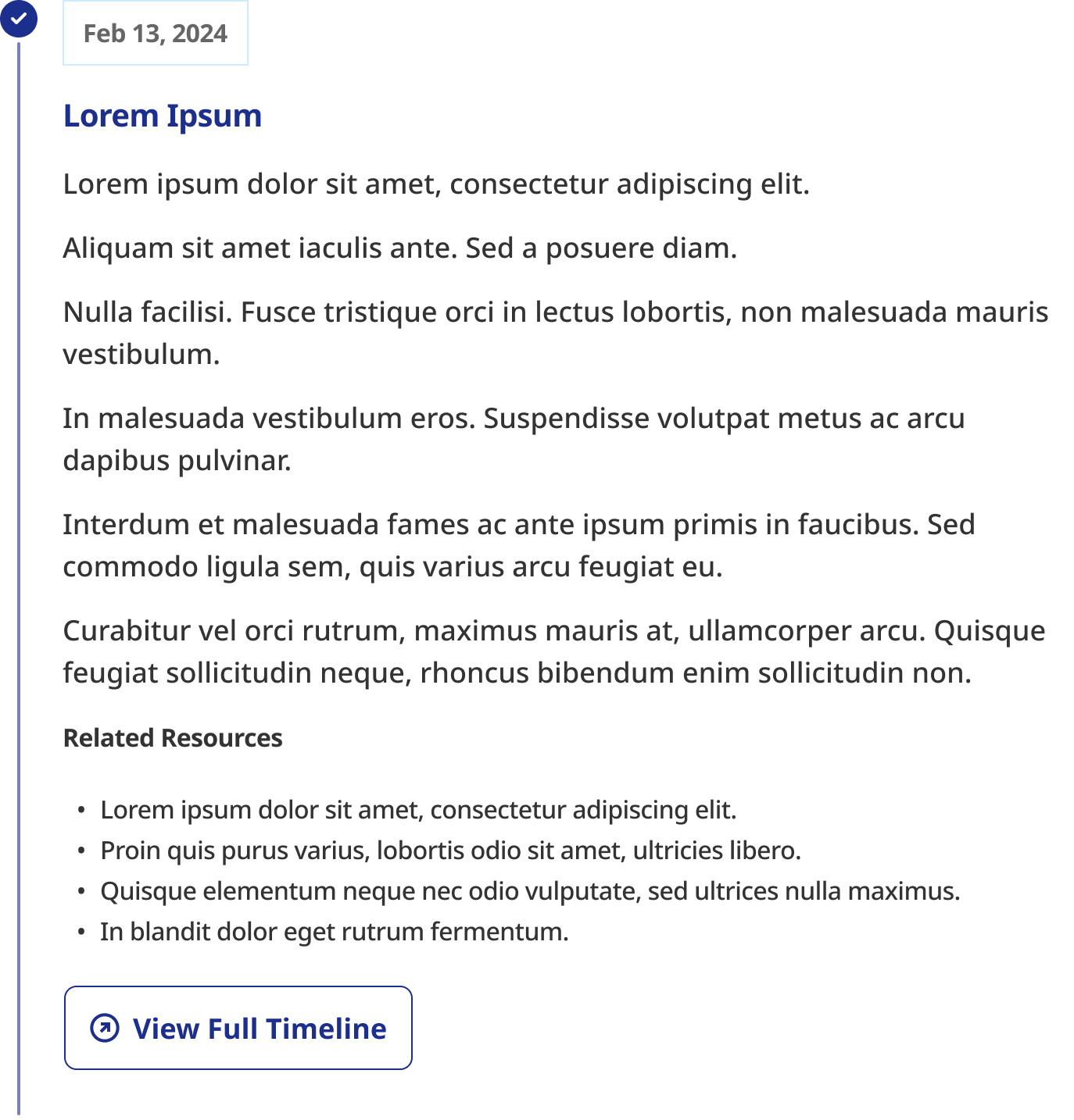
Timeline Component with Project States: Complete (Vertical)
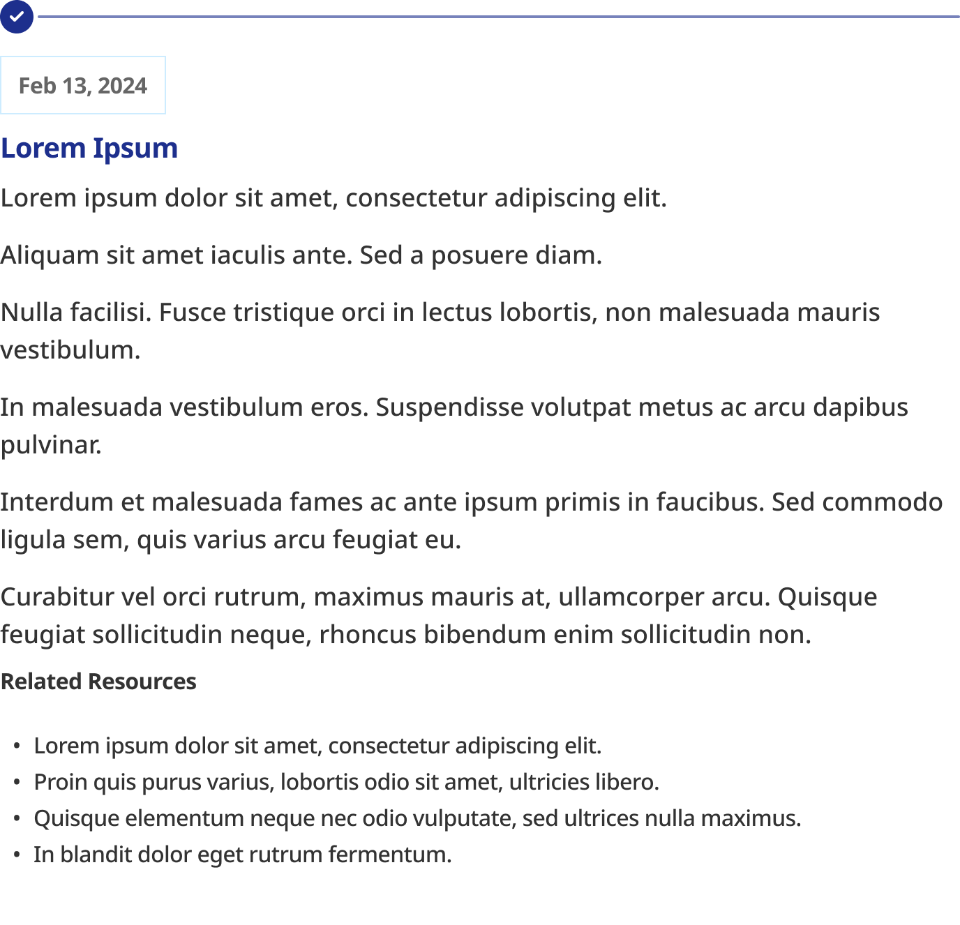
Timeline Component with Project States: Complete (Horiztonal)
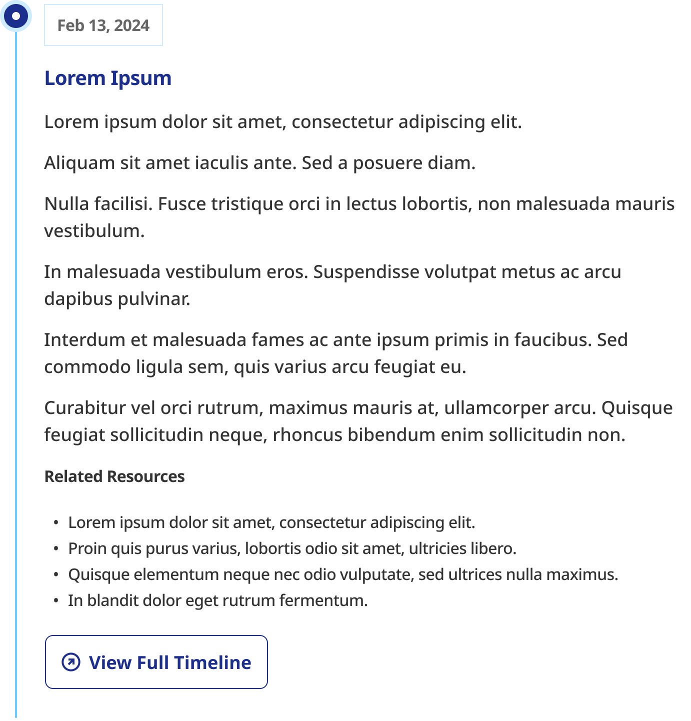
Timeline Component with Project States: Current (Vertical)
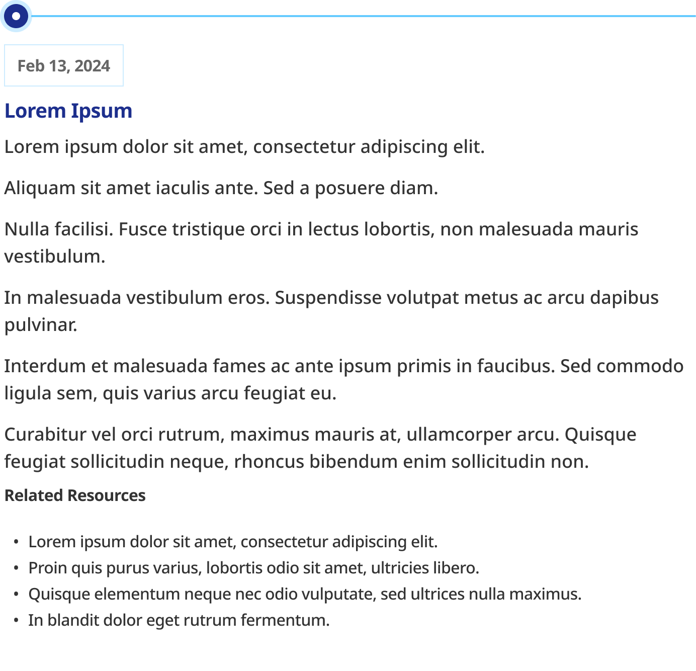
Timeline Component with Project States: Current (Horizontal)
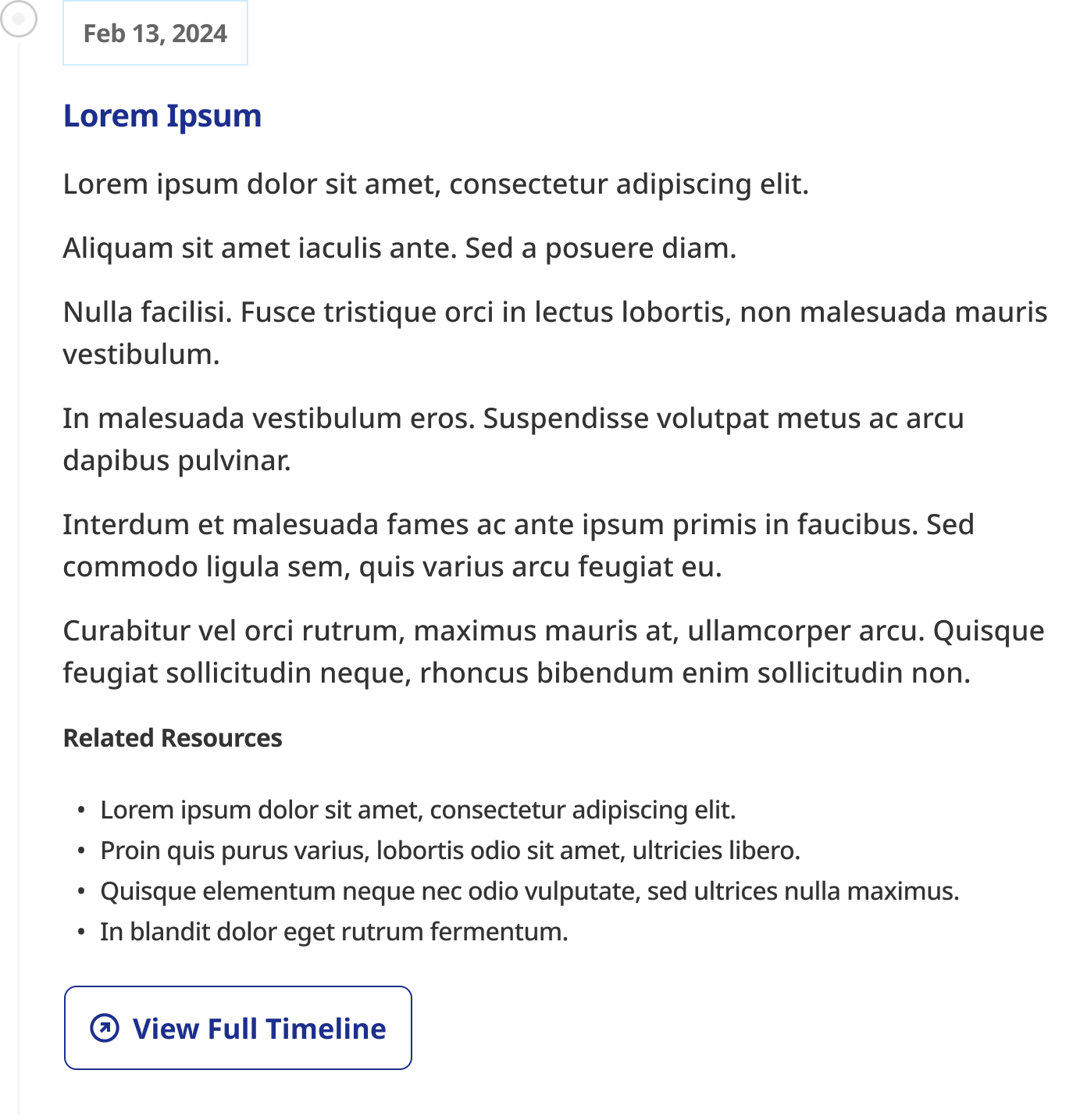
Timeline Component with Project States: Incomplete (Vertical)
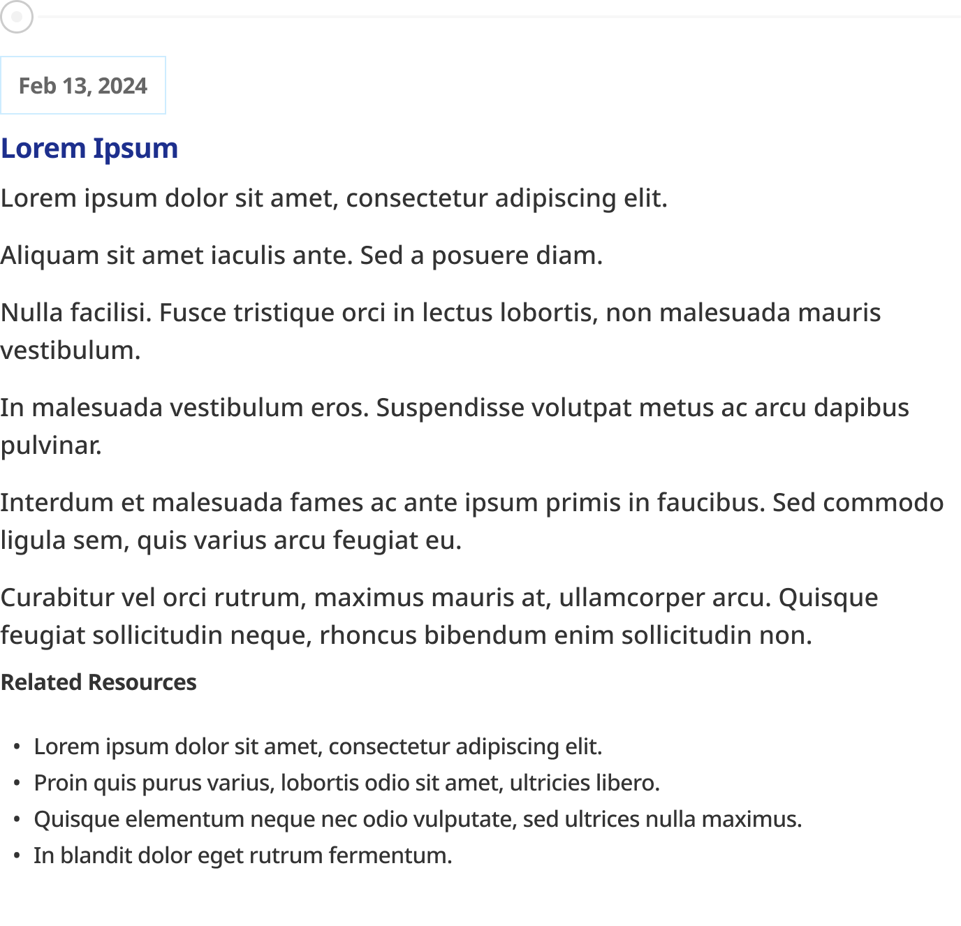
Timeline Component with Project States: Incomplete (Horizontal)
Changing something already in production
The vertical timeline was already live, so changing its architecture wasn't free.
The engineering team had to rework the frontend component, CMS configuration, backend integration, responsive behavior, documentation, and existing implementations. We also retested the vertical version to make sure the new shared structure didn't break what was already in production.
I chose that rework instead of introducing a second independent timeline component. It gave us a single place to maintain the component while still allowing the layout to change as the use case changed.
One system, two rules
The end result isn't one universal timeline that tries to handle everything. It's one component with two deliberate expressions:
Horizontal: four or fewer phases, when people need to see the current phase and what comes next quickly. Anything longer moves to the full timeline page and uses the vertical structure, so horizontal never becomes the default.
Vertical: longer timelines and histories, where people need to navigate more entries and content.
What changed in how I work
Now, when I design something for the system, I don't only ask whether it works for the use case in front of me. I ask which parts will stay the same when the context changes, and which need to move.
A reusable component isn't just something you can use twice. Its structure has to survive the second use case.