
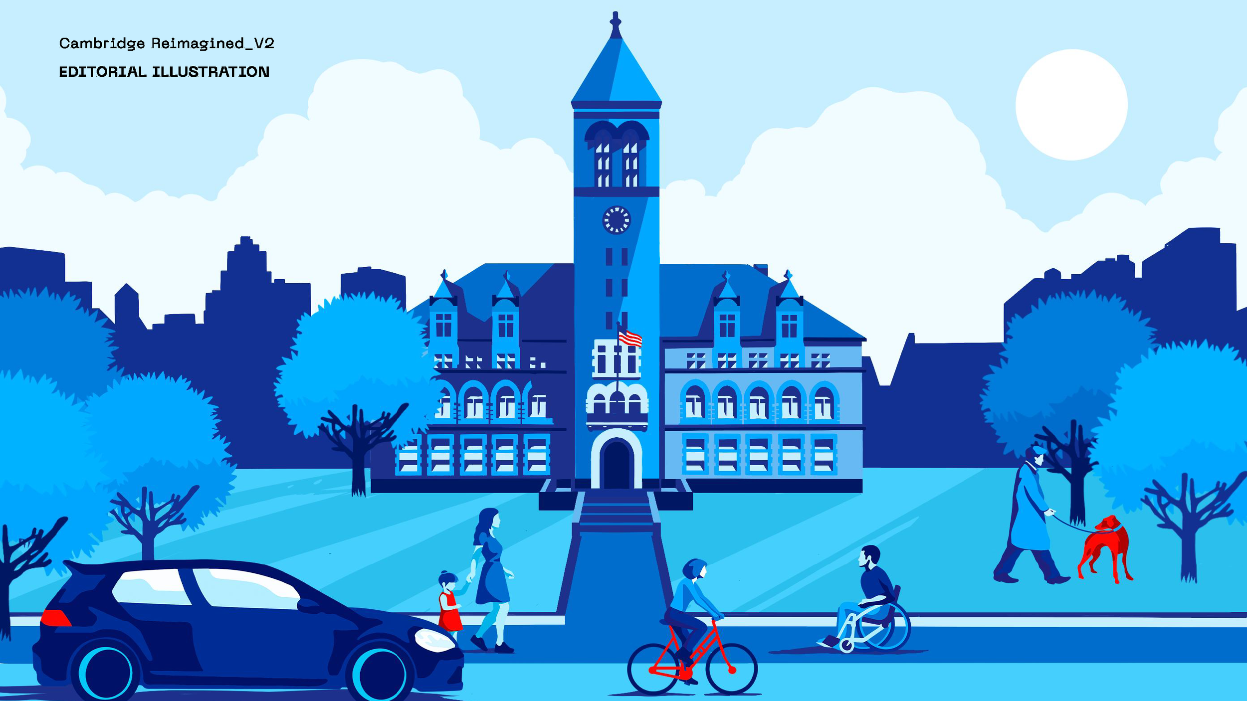
How residents find their way across 70+ City websites today, and the calls I made along the way.
Wayfinding on cambridgema.gov
From 30+ items to 12
The main navigation had been a problem for years. It had more than 30 top-level items, and most of them mirrored the City's org chart: department and program names that made sense inside City Hall but meant little to a resident looking for a service. I looked at what residents searched for and ran many usability studies and information architecture research.
The pattern was consistent: residents grouped information by what they needed, not by which department owned it.
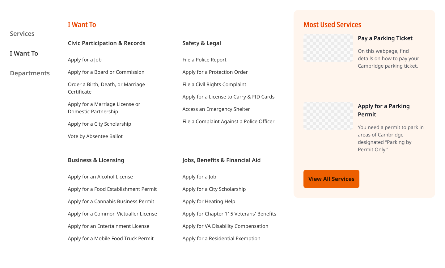
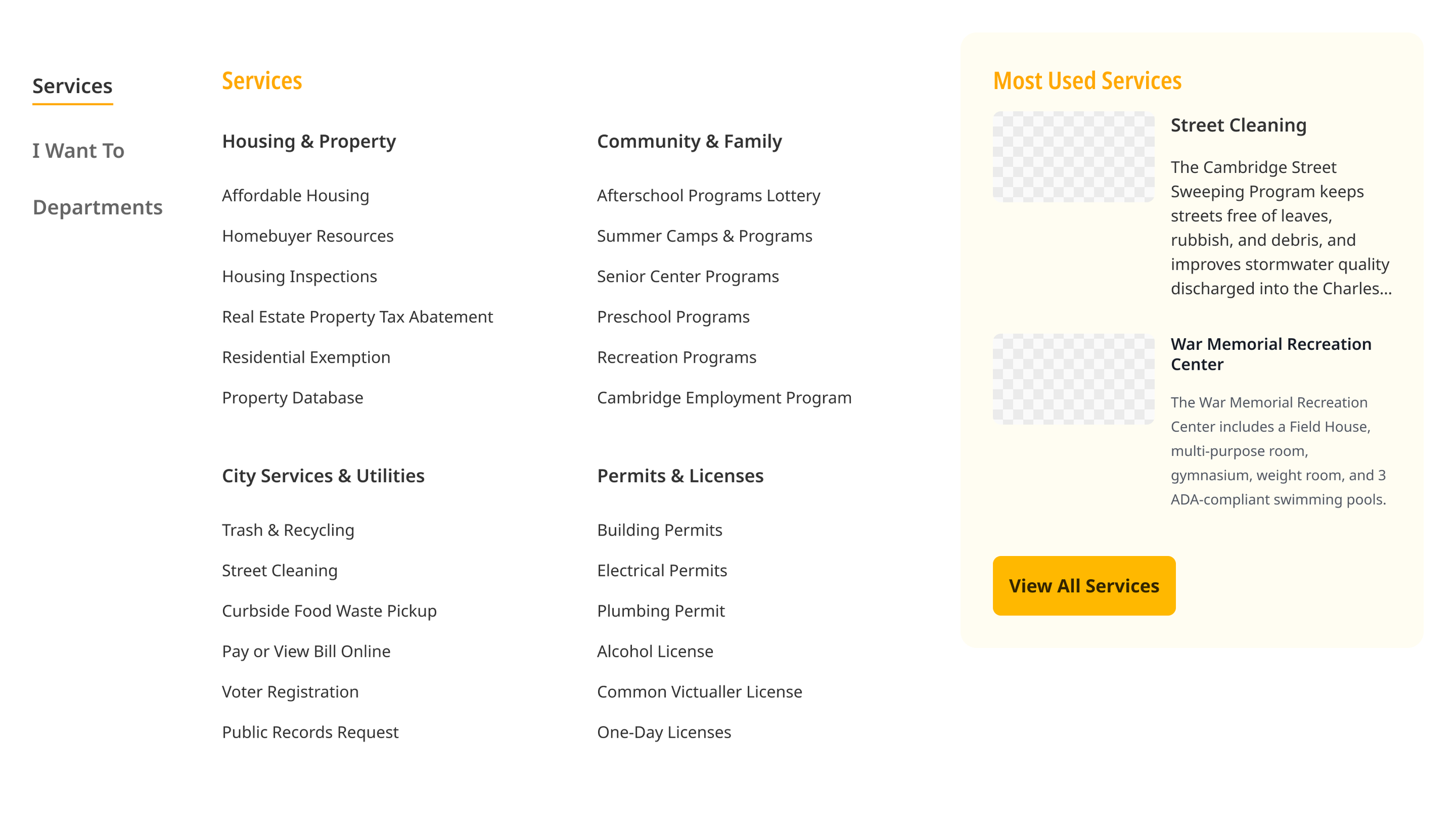
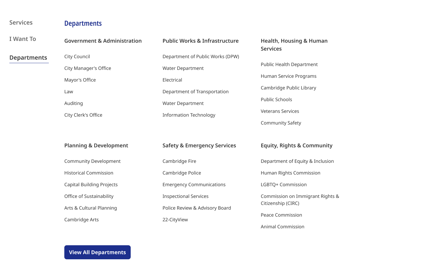
The shipped version cut the top level from 30+ items to about 12. I combined related areas where the existing content allowed it and changed how the remaining items appeared so people could scan them. Some of the old structure stayed, because the content underneath it hadn't moved yet.
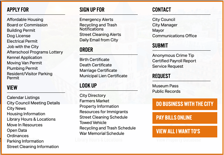
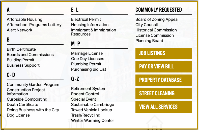
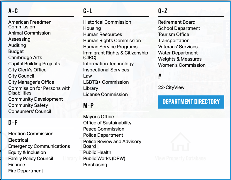


When testing didn't decide
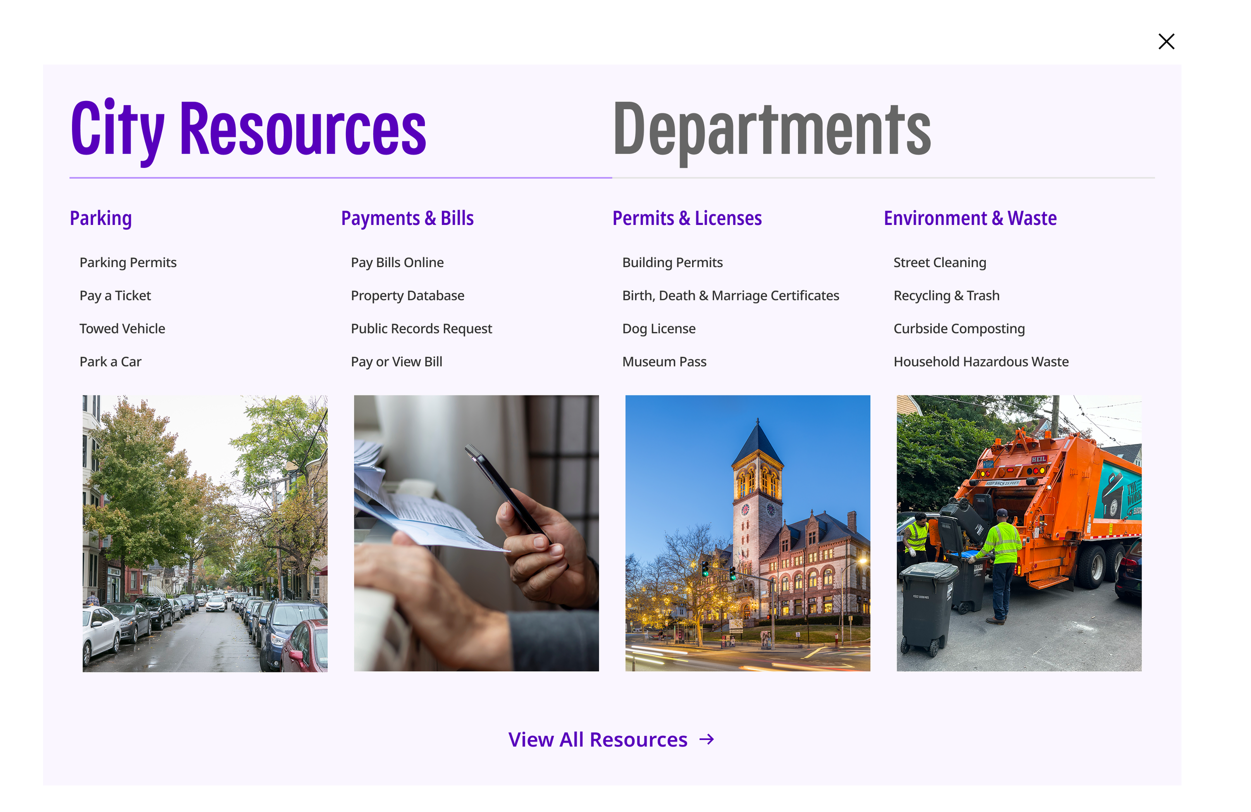
This is where the redesign started. I took two directions into testing. The horizontal navigation kept the primary options visible and stayed close to the site's current style. The hamburger menu was a drastic change: it hid the navigation behind a single button and gave the page far more room.
Testing came back 55/45 in favor of the horizontal version. Task completion was essentially the same, and both met our accessibility requirements. Close enough that the data didn't make the decision for me.
Engineering pushed back on the hamburger's extra click, and while it was a fair concern, I chose the hamburger anyway. It was a design call. The horizontal version carried much more visual weight, and I didn't want to default to the familiar pattern just because it was familiar. When the evidence is that close, refusing to choose is still a decision, and I'd rather make the call and own it.
The menu I gave up
Research pointed to a much shorter menu, built around how residents look for services. I designed it, and I still think it's the right direction. Shipping it meant restructuring content across departments, and that couldn't happen in this release. I shipped the 12-item interim menu that supports the current site content.
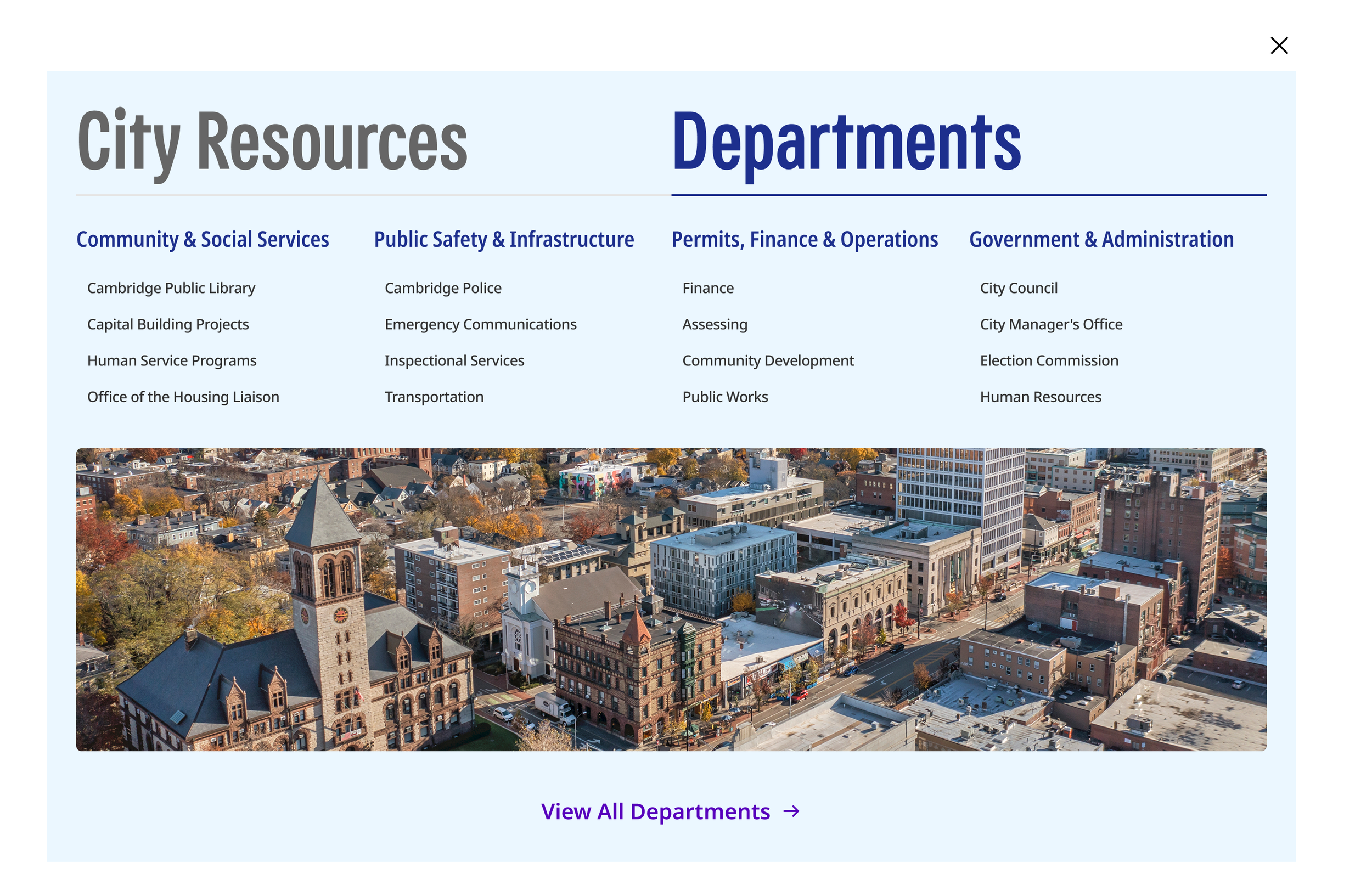
One pattern, every department
Every department's header, navigation, utility bar, search, and mobile menu is built from the same components. The mega-menu is a single pattern doing the work of 70+ separate builds.
The header has two layers. The City bar stays the same everywhere: search, language, and the main menu. Below it, each department gets its own layer, with its name, up to three menu sections, and one contact action (email or phone).
That department layer also carried the redesign of department menus, not just the main City navigation. It flexes to what each department needs. About 85% of departments don't need menu sections at all, so their layer shrinks to the department name and a contact action. The departments that do need menus get up to three sections, built from the same parts.
On mobile, the same parts collapse into a single department menu, with search scoped to that department.
Departments change their content, not their structure.
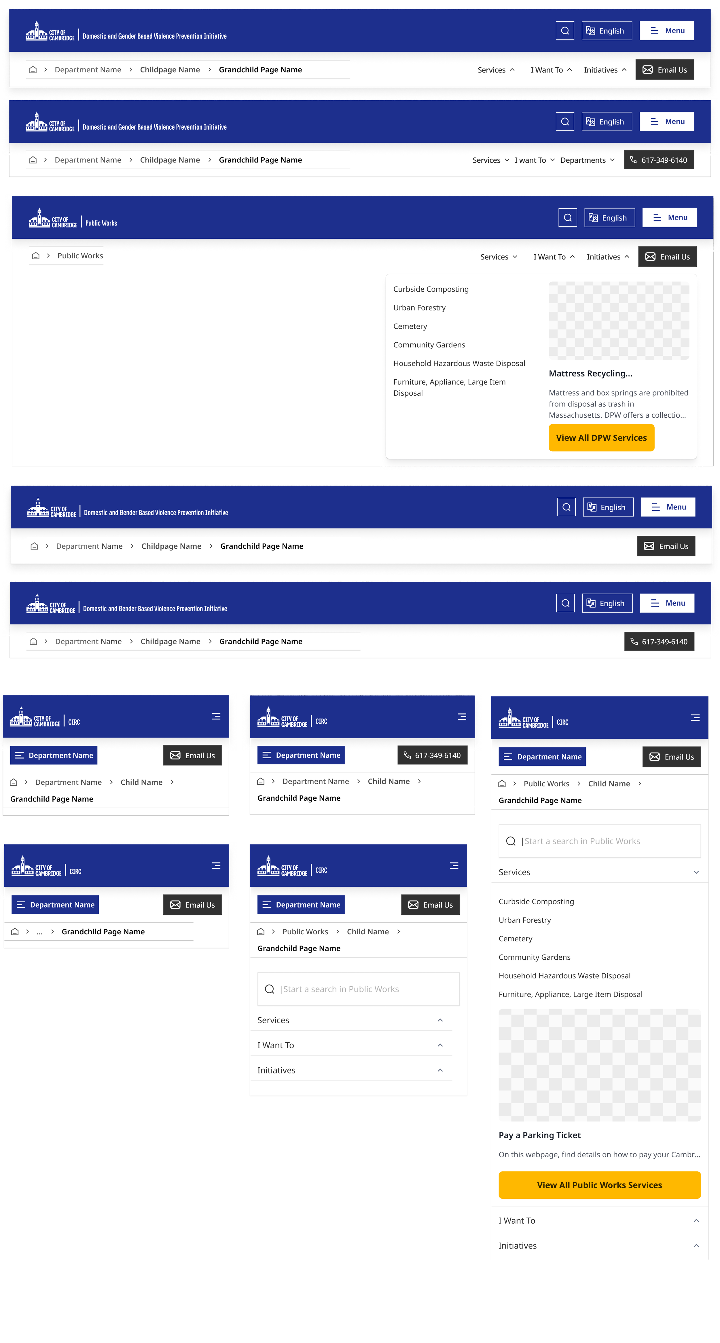
Nuts and Bolts behind the menu
Every piece of the navigation is a component in its own component, with defined states and variants. These are the parts that make up the header, the mega-menu, and the mobile menu on every site.
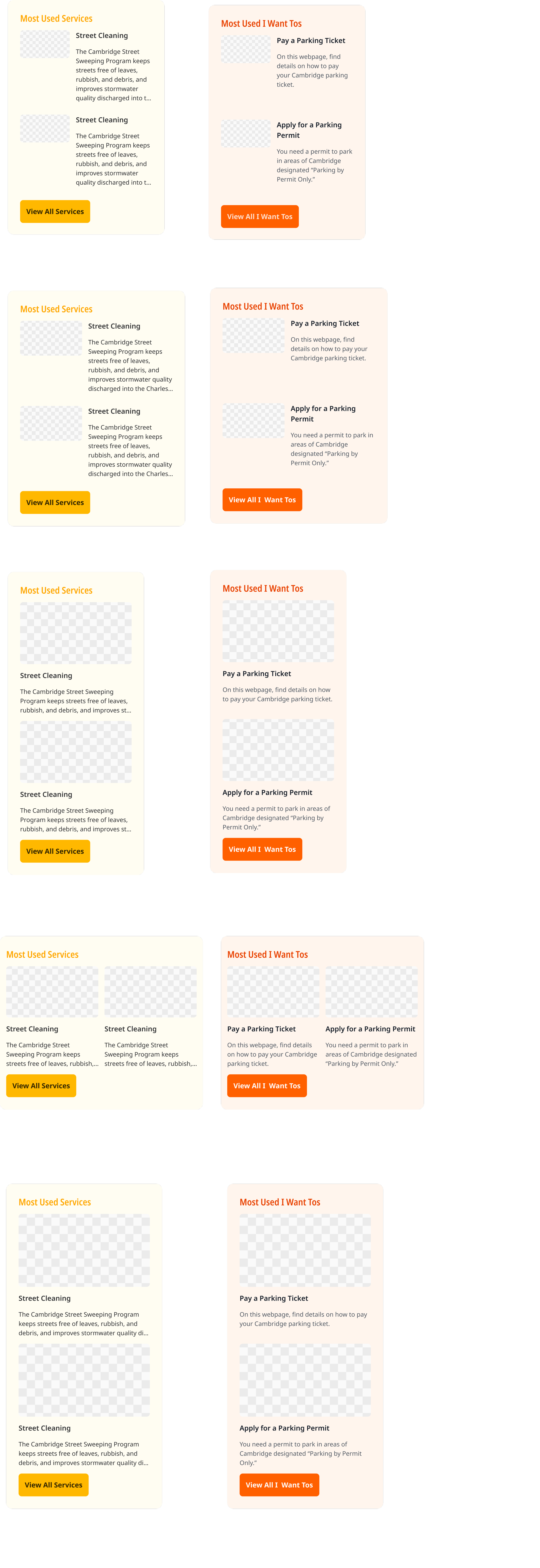
Most Used Panel Design
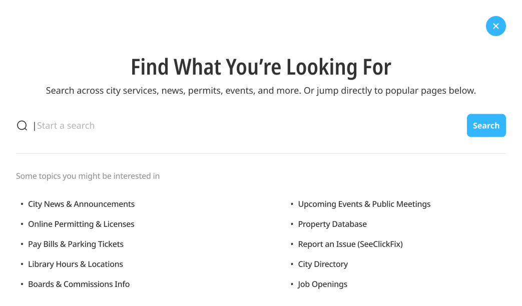
Search
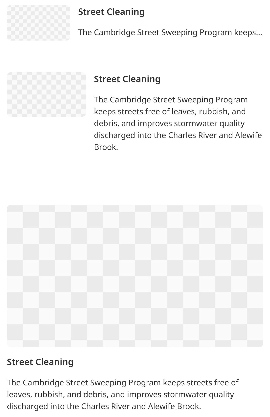
Featured Menu Components
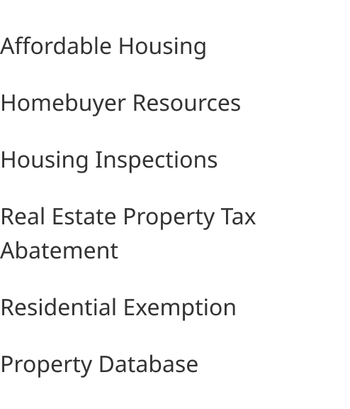
Menu Components
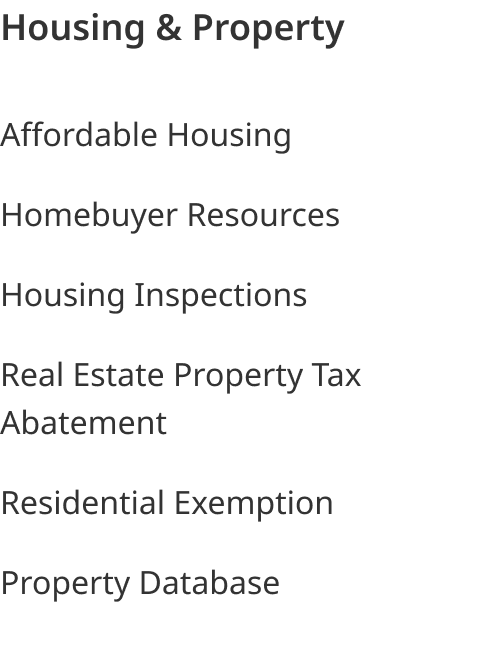
Menu Components

Department Menu Mobile Treatment
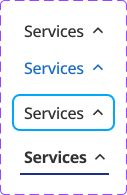
States for the left panel
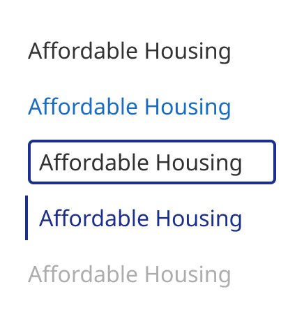
Link states.
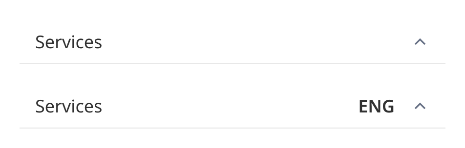
Mobile Menu Items
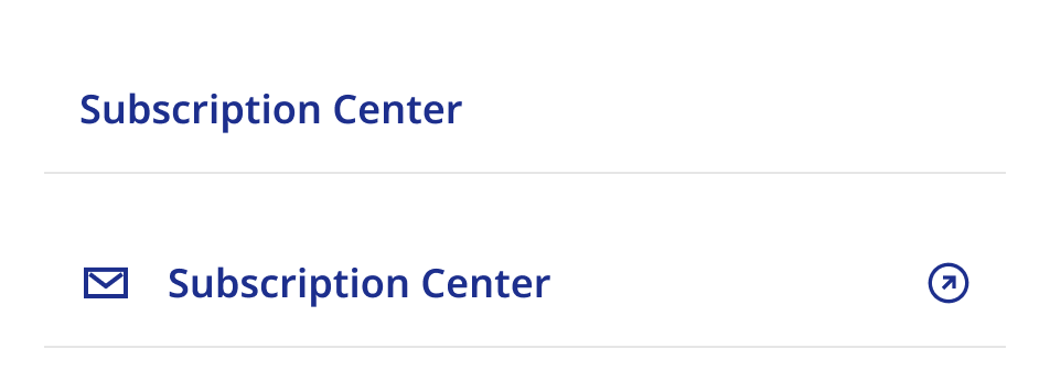
Mobile Menu Items with Links
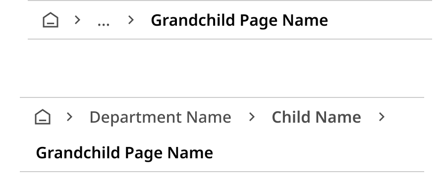
Breadcrumb (Mobile)

Breadcrumb (Desktop)
What connects them
Sometimes research gave me the answer, but the underlying content wasn't ready for it. Sometimes the data came close without deciding, and I made the call. Either way, the result had to work for a 100,000+ pages ecosystem.